USACE Case Study
U.S. Army Corp of Engineers is a section of the U.S. Military that strives to improve risk mitigation from natural and man-made disasters and assist civilians after a disaster.
The Process
I conducted three usability tests of the website to figure out the most needed areas of improvement. The results showed that their initial navigation, up to secondary, was understandable. However, when users started to have to dig for information they became confused.
Redline annotations revealed areas of improvement to make a user feel less overwhelmed when they arrive at this website for whatever reason. Improving the information architecture will assist in sorting through the vast amounts of information.
After I finished the annotations, I created a moodboard to work through determining the visual design. USACE is part of the military and they already have primary colors for a palette. Incorporating those to ideas, I figured that they would want strong and innovative elements on their website. Keeping in mind their mission statement, I also sought out elements that were demonstrative of cooperation and collaboration.

The Work
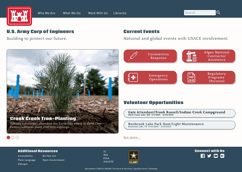
The original sitemap on the website was overwhelming and cluttered. I reduced the navigation to four primary areas and decluttered the footer. Limiting the amount of options available for a user decreases choice overload and frustration a user might feel when navigating the interface.
Sitemap

Creating the site navigation forced me to think about not only what was being presented, but how. Originally, I planned on doing a standard vertical drop-down; however, the horizontal drop-down was more efficient and saved on landscape usage. The footer portion of the website proved difficult in determining how to organize the information. I tried to keep links that went off-site together and links relating to military information together, similar with to way social media links are grouped. Once navigation was finished I added more elements from atomic design to make a more interactive homepage. From my 5-second usability tests, users commented on the cleanliness and professionalism of the design that made it seem more trustworthy.
Header & Footer Navigation
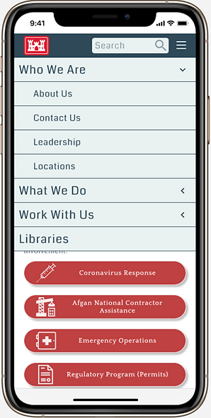
After finishing the desktop homepage I reconstructed it to fit on a mobile device. The largest challenge I faced was recreating the navigation that was consistent with the overall design. I performed some A/B testing to find the more usable navigation and found that sometimes familiarity improves satisfaction.
Mobile Design
The Results
Connecting with USACE to find out what the intent behind their website truly is and how it correlates with metrics from the design could propel this project in the right direction for usability. I enjoyed reassessing their information architecture, but the website has so much information on it, a content audit would be necessary prior to implementing any of the changes I've suggested here.